
Brand & CI
Symbol, wordmark and core colours — a concise public reference for consistent use on the web, in documents and decks.
Symbol
Six-dot mark
The six dots in a 2×3 array symbolise structure and stability; the connecting element at the lower left expresses organic connection and collaboration.
In favicons, compact UI, business cards and other constrained spaces, the symbol may be used on its own.
Horizontal lock-ups
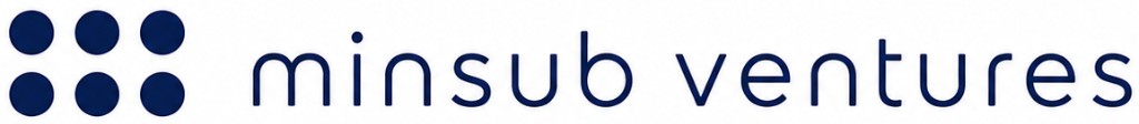
01. Base dot symbol + wordmark
The six dots stand for people, companies, systems, data, trust and growth.
A balanced layout of independent elements symbolises Minsub Ventures’ platform role—connecting and operating diverse fields in a structured way.
A simple, orderly grid expresses stability, professionalism and global standards.
Horizontal lock-ups
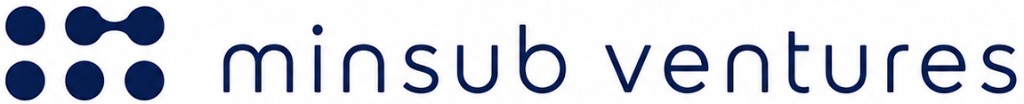
02. Dot mark (bottom link) + wordmark
The bottom-linked structure stands for a stable foundation and a sustainable operating system.
Like an invisible base firmly joined, it expresses how Minsub Ventures supports clients’ operations, compliance and financial structures.
Smooth continuity conveys trust, collaboration and long-term partnership.

Horizontal lock-ups
03. Dot mark (top link) + wordmark
The top-linked structure symbolises Minsub Ventures’ role in organically connecting people, companies and a global network.
Dots flowing into one stream reflects a one-stop system that integrates accounting, tax, legal, incorporation, operations and more.
The top link carries the ideas of strategic connection and business expansion.
Horizontal lock-ups
04. Geometric mark + wordmark
The diagonal mark conveys forward direction and fast execution.
Two flows converging in one direction symbolise a partnership that links customers and markets and grows together.
The final circle stands for goals, outcomes and completion—and Minsub Ventures’ philosophy of completing clients’ India market entry and growth.

Colour
Core palette
Navy (type & fields)
#0F2744
Primary emphasis, symbol areas, and supporting elements on dark backgrounds.
Blue (accent)
#0071E3
For links, buttons and accent elements used in interaction and to guide attention.
Usage
Quick guidelines
- Do not arbitrarily change or distort wordmark proportions.
- On solid backgrounds, keep official colour contrast; use a solid inverted version when needed.
- For external productions, use the official PDF, SVG and PNG files.
More
Contact, rights & type
- Contact
- For CI/logo usage questions or official asset requests, email info@msventures.in and we’ll respond as soon as we can.
- Copyright & trade marks
- The logos, wordmarks and symbols are brand assets of Minsub Ventures. Do not distort them or redistribute/reuse them for commercial purposes without prior agreement. If the scope of use is unclear (press, partner materials, etc.), please confirm via the address above.
- Typography (web)
- This public site uses a system sans-serif stack (e.g. -apple-system, Segoe UI, Roboto) with Noto-style fonts for Korean text. For external materials, prefer a readable, neutral sans-serif to stay close to the on-site tone.